GROUP 4
QIULIHUA/0365036
Illustration and Visual Narrative/Bachelor of Design (Honours)in Creative Media
LECTURES
week 1:
Mr Hafiz started us off by giving us access to Google Classroom and learning resources. He also introduced us to the Adobe Illustrator workspace and toolbar. Mr Hafiz showed us about illustration and visual narrative and gave us some module information.The aim of the module was to introduce students to the process of creating visual concepts from ideas and communicating the images to an audience in the form of illustrations. Finally and showed us our assignment for the semester.
WEEK 2:
Mr Hafiz introduced the game 'The bezier game' during the lesson and asked us all to participate in it to better understand how to use the pen tool.

|
| FIG 1.0 'The bezier game' |

|
| FIG 1.1 |
WEEK3:
This week we learnt more about Adobeillustration and Mr Hafiz showed us how to create graphics using the pen tool.

|
| Fig 1.2 Shape Tool |

|
| FIG1.3 Pen Tool |

|
| FIG 1.4 Pen Tool |
WEEK4:
CHIAROSCURO
- CHIAROSCURO
The use of light and dark tocreate the illusion of three-dimensional volume on a flat
surface.
The purpose of chiaroscuro is to increase the scene’s dramatic tension by exaggerating the subject’s importance using color or light contrast.

|
| Fig 1.5 The Calling of St Matthew (Caravaggio, 1599 - 1600) |
- LOW-KEY LIGHTING
A style of lighting for photography, film or television.It accentuates the contours of the
subject by throwing areas into shade while a fill light or reflector may illuminate the shadow areas to control contrast.

|
| Fig 1.6 Barry Lyndon (Kubrick, 1975) |
This method is an excellent lighting choice to differentiate positive vs negative spaces
--NCREASE DRAMATIC TENSION :Gives thrilling emotive depth on the look and feel in the scene
--CREATE SENSATIONAL EFFECT:Helps elevate fantasticalviewpoints to emphasis on the narrative
--ATTRACT ATTENTION: Establish visual hierarchy, the main point of the scene
--MAKE TASTEFUL COMPOSITION:The play on negative VS positive spaces creates
attractive scenes
WEEK 5-WEEK 6:
Due to public holidays and teachers not feeling well, there were no lectures for a fortnight.
WEEK7:
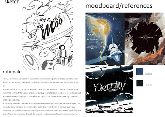
Mr Hafiz Zamri explained to us how we were going to do the next task, and we were going to do some animation based on the album cover.
Composition Theory 3
Fore, Mid, and Background
1. Composition: Composition refers to the way an image is laid out and organised.
2. Techniques: There are a number of techniques that can help you to better organise your compositions and, if used correctly, can take a work of art to a higher level.
3. Attracting the audience's attention: By using these techniques appropriately, you can make the artwork more able to attract the audience's attention and make it more noticeable.
INTRO
1. Scene Composition: When composing a scene, it is important to effectively convey a sense of space.
2. Spatial hierarchy: By including a foreground (close to the viewer), a midground, and a background (away from the viewer) in the image, a sense of scale is immediately conveyed to the viewer.
3. Sense of Scale: This method of composition helps the viewer to immediately perceive the size and distance relationships of the objects in the image.
 |
| Fig 1.7 foreground,middle-ground, and background |
 |
| Fig 1.8 DIFFERENT TYPES OF PLANES |
1. Foreground Arrangement: You can arrange your subject in the foreground.
2. Example: Highlight the foreground as the main focus by using size differences and colour contrasts.
Middle-ground Focus:
1. Mid-range arrangement: You can arrange the focal point in the mid-range.
2. Example: Highlight the main focal point by using size differences and contrasting light and shadow.
Background Focus:
1. Background Arrangement: You can arrange the focal point at the furthest point of vision, i.e. the background.
2. Example: Highlight the main focal point by using shapes and contrasting light and shadow.
Design Flow
A good arrangement of visual focal points in the foreground, midground and background should be able to show a sense of movement and rhythm in the design. This is referred to as the Design Flow
Definition
Design flow is the way your eye moves or is guided through a composition. A design with good flow smoothly guides the viewer's eye as it moves through the layout, from one element to another.
 |
| Fig1.9 Design Flow |
- Your visual design should be able to influence the way your audience digests your content.
- This is especially important in the interface design and information design genres, as you need to combine text, lines, contrast, colour and imagery
INSTRUCTIONS
.jpg)
|
| Fig 1.7Vormator Challenge |
- Pencil Tool
- Envelope Distort
- Blend
- Intwine
 |
| Fig 2.1 exercise |

|
| Fig 2.1 My Pokemon with shadows |
Next I designed the background, but as the background was similar in colour to my Pokemon, it didn't reflect the main visual, so I toned down the image as a whole.

|
| Fig 2.2 process |

|
| Fig 2.3 final process |
.jpg)
|
| Fig 2.4 Pokemon Card |

|
| Fig 2.5 Fly Me To The Moon |

|
| Fig 2.9 Animation 1 |
 |
| Fig 3.0 Animation 2 |


.jpeg)


Comments
Post a Comment