
QIULIHUA/0365036
GCD 61004/Advanced Typography/Bachelor of
Design (Honours)in Creative Media/Taylor's University
Task 2 Key Artwork & Collateral
LIST
INSTRUCTIONS
INSTRUCTURE
AdTypo_5_PerceptionAndOrganisation
Perception & Organisation:
Perception is “the way in which something is regarded, understoodor interpreted".
Perception in typography deals with the visual navigation and interpretation of the reader via contrast, form and organisation of the content.

|
| Fig 1.0 contrast(Rudi Ruegg) |
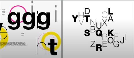
- Carl Dair on the other hand adds a two more principles into the mix;texture and direction “to make design work and meaning pop out -clearly and unambiguously, and with flair.
- Dair posits 7 kinds of contrast (most of which has already beencovered by Rudi Reugg albeit using different terms): 1. Size, 2.weiqht, 3.contrast ofform, 4.contrast ofstructure, 5. contrast ottexture,6 contrast ofcolour and 7,contrast ofdirection.

|
| Fig 1.1 Size |
|
| Fig 1.2 weight |
|
| Fig 1.3 Structure |
Texture
By putting together the contrasts of size, weight, form, and structure.and applying them to a block of text on a page, you come to thecontrast of texture. Texture refers to the way the lines of type look asa whole up close and from a distance. This depends partly on theletterforms themselves and partly on how they're arranged

|
| Fig 1.4 Texture |
Colour
The use of color is suggested that a second color is often lessemphatic in values than plain black on white. Therefore it is importantto qive thought to which element needs to be emphasized and to payattention to the tonal values of the colors that are used

|
| Fig 1.5 Colour |
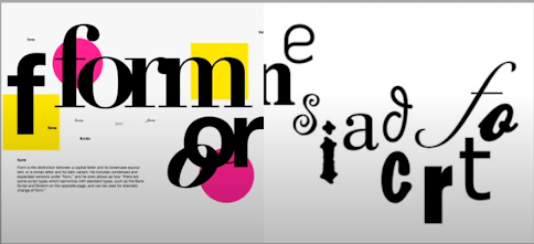
Form
- For refers to the overall look and feel of the elements that make upthe typographic composition. lt is the part that plays a role in visualimpact and first impressions, A good form in typography tends to bevisually intriquing to the eye; it leads the eye from point to point, itentertains the mind and is most often memorable.
- Originating from the Greek words “typos"(form) and “graphis(writing),typography means to write in accordance with form.Typography can be seen as having two functions:
2. to do so in a visual form.
Organisation
Gestalt
Gestalt is a german word meaning the way a thing has been “placedor “put together". Gestalt Psychology is an attempt to understand thelaws behind the ability to acquire and maintain meaningfulperceptions.

|
| Fig 1.6 Gestalt |
Gestalt theory emphasizes that the whole of anything is greater thanits parts-this is based on the idea that we experience things asunified whole: nstead of breakina down thouahts and behavior totheir smallest elements, the gestalt psychologists believed that youmust look at the whole of experience.
Organisation/Gestalt:
Perceptual Organisation /Groupings
- Law of Similarity:The Law of Similarity is the gestalt grouping law that states thatelements that are similar to each other tend to be perceived as aunified group, Similarity can refer to any number of featuresincluding color, orientation, size, or indeed motion.
- Law of Proximity:The Law of Proximity is the gestalt grouping law that states elementsthat are close together tend to be perceived as a unified group. Thisstraightforward law states that items close to each other tend to begrouped together, whereas items further apart are less likely to begrouped together.
- Law of Closure:The Law of Closure refers to the mind's tendency to see completefigures or forms even if a picture is incomplete, partially hidden byother objects, or if part of the information needed to make a completepicture in our minds is missing
- Law of Continuation:Law of (Good) Continuation holds that humans tend to perceive eachof two or more obiects as different, singular, and uninterrupted objecteven when they intersect. The alignment of the objects or forms playsa major role for this principle to take effect.
- Law of Symetry
- Law of Simplicity (Praganz)
EXERCISE
Task 2 (A) – Key Artwork
Mind mapping / Inspirations
Mind-map:
First I made a mind map about myself
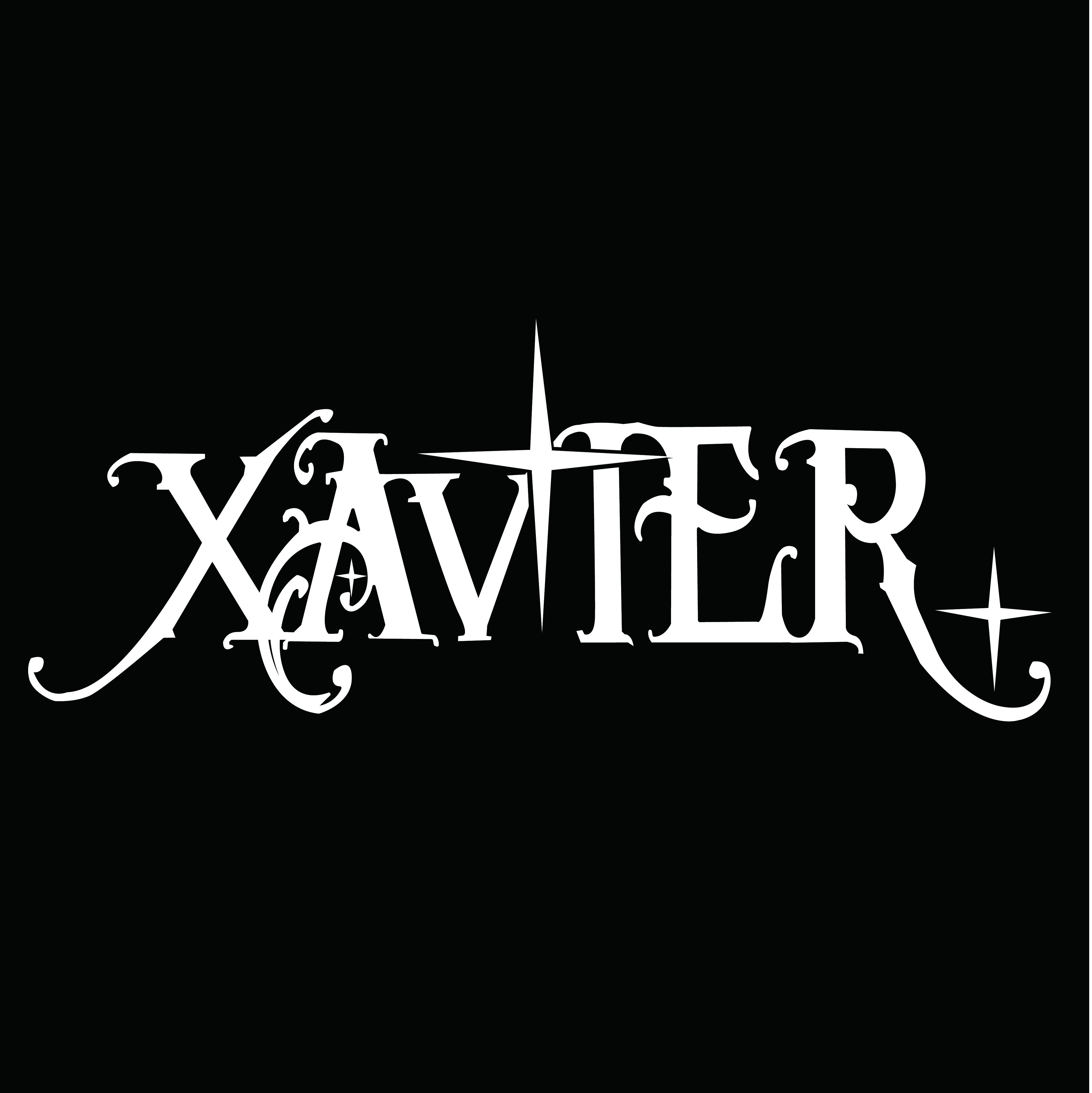
I will use the "Xavier" to accomplish this task

|
| Fig 1.7 mind map ,WEEK 4 |
Mood-board:
For the first, I tried to use a more mysterious looking font style to make him show the mystery and holy spirit of the stars

|
| Fig 1.8 Font Reference,WEEK 4 |
For the second, I look for something with a more regular, clean typeface and with a star pattern

|
| Fig 1.9 Font Reference,WEEK4 |
Sketches :

|
| Fig 2.0 Sketches,WEEK4 |
I ended up choosing a fifth draft and digitizing it.
Final digitized:

|
| Fig 2.1 Final digitized(JPEG),WEEK5 |
Animated Key Artwork:

h making the letters appear gradually. I thought about making them appear at different times and with different levels of brightness, so I adjusted the transparency of each letter to make it more layered.

Final Animated Key Artwork:

|
| Final Animated Key Artwork , Week 5 |
Color Applications
For color palettes I use the Colour Hunt website to find color combinations that I like. Selecting multiple color palettes I put them together and compared the final results.

|
| Fig 2.2 Palette Exploration,WEEK 5 |

|
| Fig 2.4White wordmark on white background,WEEK5 |
|
| Fig 2.5 Black wordmark on black background,WEEK5 |

|
| Fig 2.6 Colour Palette,WEEK5 |

|
| Fig 2.7 Wordmark in actual colours on lightest shade of colour palette,WEEK5 |

|
| Fig 2.8 Wordmark in lightest shade of colour palette on darkest shade of colour palette,WEEK5 |
|
|
| Fig 2.9 Key Artwork Animation, Week 5 |
Fig 3.0 Task 2A PDF Compilation
Task 2(B) Key Artwork & Collateral :
Collateral 1, 2, 3
Instagram handle & link
IG screen grab with good resolution. IG featuring 9 tiles (profile must feature a bio).
*1024px x 1024px, 300ppi (each artwork).
I chose the type of collateral based on my font logo design, and to better showcase the theme of the font logo design, I chose mockups of canvas bags, cups, and records.
All mockups were done using Adobe Photoshop, with patterns and designs prepared using Illustrator layouts.

|
| Fig3.1 layout |
- Deployment on Instagram
At this stage, we just need to plan/schedule the feed:

Final Task 2B : Collateral

|
| Collateral 1 - Record, Week 7 |

|
| Collateral 2 - Tote Bag, Week 7 |

|
| Collateral 3 - cup, Week 7 |

-21.jpg)
|
| Fig 3.3 White wordmark on black background,week9 |
_%E7%94%BB%E6%9D%BF%201%20%E5%89%AF%E6%9C%AC%206.jpg)
|
| Fig 3.4 Black wordmark on white background,week9 |
-19.jpg)
|
| Fig 3.5 Colour Palette,week 9 |

|
| Fig 3.6 Wordmark in actual colours on lightest shade of colour palette,WEEK9 |
-20.jpg)
|
| Fig3.7 Wordmark in lightest shade of colour palette on darkest shade of colour palette,WEEK9 |

|
| Fig3.8 Key Artwork Animation, Week 9 |
Fig 3.9 Task 2A PDF Compilation

|
| Fig 4.0 Collateral 1 - Record, Week 9 |

|
| Fig 4.1 Collateral 2 - Tote Bag, Week 9 |


|
| Fig 4.3 Instagram Design Layout |
FEEDBACK

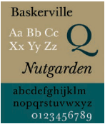
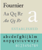
- French printer and type designer whose work formed the basis for Giambattista Bodoni's type design.
- Fournier's typefaces, such as Monotype Fournier and Barbou, and later Dwiggins Electra, all derive from his style.
- His innovations in type proportions and weights were influential in later type design.
- In 1734, Caslon's typeface debuted, based on the old Dutch style but with English touches, becoming the first great English typeface.
- Caslon's typefaces were hailed as the "national typeface" of England, and became widely popular, setting the standard for serif typefaces.

- Bodoni's work is considered one of the most refined and elegant typefaces in history. He had ample time and resources to work on his designs, focusing only on projects of his own choosing.
- Bodoni's typefaces evolved from the old style of Fournier to the modern style he created. He gradually perfected modern typeface design by adjusting individual letters of existing typefaces.
- He was one of the most prolific type designers in history, creating hundreds of typeface styles. Statistics in 1840 show that he designed more than 25,000 typefaces and 50,000 typeface molds.

 | ||
| RudolfKoch, | 1924 |
- One of the most influential and prolific type designers in the United States, he was self-taught and did not start designing typefaces until he was 30 years old.
- He designed a wide variety of typefaces and was known for his unique personal style. Goudy emphasized the marketing of typefaces and created beautiful sample books and promotional materials, combining type design with marketing, setting a model for later type designers.
- Many of Goudy's typeface designs are still widely used today.
- Referred to as the "Father of American Type Design", he was the main designer of the American Type Foundry (ATF) and was responsible for typeface development for more than 35 years.
- He created a wide range of typefaces, including advertising fonts (such as Broadway, Tower, Wedding), sans serifs (such as Alternate Gothic, Franklin Gothic, News Gothic), and classic serifs (such as Century Oldstyle, Cheltenham, and Stymie).
- Benton also designed a modern version of the Bodoni Replica typeface and the highly readable Century Schoolbook, which made significant improvements to the usability and readability of typefaces.
- Under his leadership, ATF became the foundry with the most extensive range of typefaces in the world at the time.
- Type Design in Germany
- A leading German typographer and designer who worked with the Bauer type foundry to design many classic typefaces.
- Rudolf Koch (1876–1934)
- Known as a calligrapher and educator, he worked with the German Klingspor type foundry.
- Designed the famous sans-serif font Kabel, as well as the calligraphic fonts Locarno and Neuland, which were later expanded into larger series and are still used today.
- Other works include Holla, Jessen, Marathon, and Wallau.
- Bernhard was a character with a strong personality who rejected modern technology but was extremely creative and influential in type design. His design style was simple and practical, and influenced the development of modern advertising fonts.
- Renner's contribution is not mentioned in detail in this paragraph, but he was an important figure in modernist type design, and later sans-serif type design (such as Futura) was deeply influenced by him.
Comments
Post a Comment