Week 1 - Week 4

23Apr 2025 - 18May2022
2.Statistical Infographics
A how-to infographic explains how to do something, like how to solve a
problem or perform a task
4. Timeline infographics
6.Map or location infographics
Map infographics can be used for a variety of purposes. People tend to use them when they want to communicate demographic data or other location-specific information.
EXERCISE 2: L.A.T.C.H INFOGRAPHIC POSTER
The following is the proposal:
Typography and color scheme:
Draft layout:
I ended up choosing the first draft layout because I tried two drafts and after adding the color scheme I chose, the first draft layout was relatively bad and the second one was relatively perfect.
I completed the final design on the colored picture. During the design process, I found that the dotted lines I designed in the draft could not show the effect I wanted, so I built a semicircular arc under the center highlight and adjusted its transparency to prevent it from competing with the center picture for visual effect.
I also zoomed out the center image to make it look more refined. In the
places with dotted lines in the previous sketch, I added tea tasting tips,
combining three circles of different colors.
Finally, I found that the text of this part I designed was too small, not convenient for readers to read, and the layout was a little confusing, so I made some modifications and presented it in the form of a tea process diagram from large to small.
Final Outcome:
23Apr 2025 - 18May2022
QIULIHUA/0365036
information design / Bachelor of Design (Honours)in Creative Media
lecture &excerise——information design
INSTRUCTION
LECTURE:
WEEK 2:
Type of Infographics
Infographics are highly effective when it comes to increasing
engagement and capturing your audience’s attention.
An infographic is a powerful way of communicating ideas in a
visual form.
8 types of infographics
- List infographics
- Statistical infographics
- How-to infographics
- Timeline infographics
- Comparison infographics
- Map and location infographics
- Flowchart infographics
- Process description infographics
- List infographics
A list infographic is an informational graphic that uses a written
list to get a message across. It’s full of written copy, but it’s also
highly visual.

|
| Fig 1.0 List infographics |
2.Statistical Infographics
A statistical infographic is an infographic that includes pie charts,
bar graphs, and any other visual representations of data.
Using a statistical infographic to represent the information in a visual
way is more easier to understand.

|
|
|
Fig 1.1 Statistical Infographics
|
3. How-to infographics

|
|
Fig 1.2 How-to infographics
|
4. Timeline infographics
The timeline infographic is not only useful and informative, but it’s
also visually appealing.
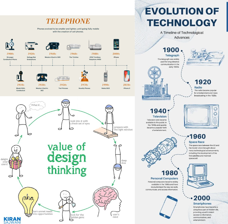
|
| Fig 1.3 Timeline infographics |
5. Comparison Infographics
The comparison infographic couldn’t be missing from this list of the
best types of infographics.
A comparison infographic is a visual way to compare and contrast
different options.

|
|
Fig 1.4 Comparison Infographics
|
Map infographics can be used for a variety of purposes. People tend to use them when they want to communicate demographic data or other location-specific information.

|
| Fig 1.5 Map or location infographics |
7. Flowchart infographics
- A flowchart infographic is a graphical representation of an information stream, such as a sequence of different steps or actions.
- This type of infographic boosts engagement while giving users a very clear idea of what the process is about.
- Because it guides people individually through the various steps, it feels more personal and tends to resonate closely with potential audiences.

|
| Fig 1.6 Flowchart infographics |
8.Process description infographics
- A process description infographic visually describes the main elements, actions, and steps of a process.
- A process description infographic to communicate technical information or a complex series of actions.
- It’s useful because it highlights the most important steps, and simplifies complex ideas by breaking them down and then grouping them by category.
WEEK 3:
L.A.T.C.H Theory
1. Location
- Definition: Organize information based on geographic or spatial location.
- Application scenarios: Maps, indoor guides, exhibition hall layout.
- Advantages: Clear, intuitive, suitable for content with dense geographic information.

|
| Fig1.7 Location |
2. Alphabet
- Definition: Arrange information in alphabetical order.
- Application scenarios: Address book, dictionary, index list.
- Advantages: Easy to find, suitable for information collection without other priorities.

|
| Fig 1.8 Alphabet |
3. Time
- Definition: Arrange information in chronological order (past → present → future).
- Application scenarios: Timeline, news, historical events, project management.
- Advantages: Helps understand the development of events and cause and effect.

|
| Fig 1.9 Time |
4. Category
- Definition: Categorize information by topic or type.
- Application scenarios: E-commerce websites, museum exhibits, content catalogs.
- Advantages: It is easy for users to locate the required content based on their interests or functions.
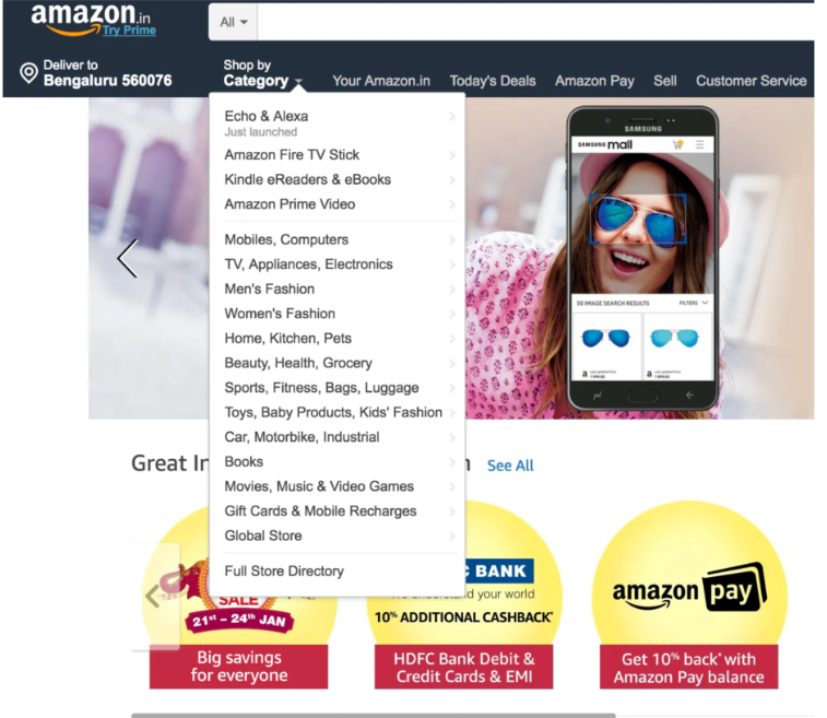
|
| 2.0 Category |
5. Hierarchy
- Definition: Sort information based on importance, size, value, weight, etc.
- Application scenarios: Rankings, menu navigation, organizational charts.
- Advantages: Highlight the primary and secondary relationships and guide users to focus on key content.

|
| Fig 2.0 Hierarchy |
WEEK 5:
Information Architecture:
1. Manuel Lima’s 9 Directives Manifesto
- Form Follows Function: “the purpose should always be centered on the explanation, which in turn leads to insight.”
- Interactivity is Key: Allows for investigation and learning through discovery.
- Cite Your Source: Always disclose where your data originated.
- The Power of Narrative: Humans love stories. Elaborate your information into storytelling to make it more interesting and memorable.
- Do Not Glorify Aesthetics: “should always be a consequence and never a goa

|
| Fig 2.1 Do Not Glorify Aesthetics |
- Look for Relevancy: Why are you visualizing the information?

|
| Fig 2.2 Look for Relevancy |
- Embrace Time: Time is difficult to work with. That’s why time management is one of the key factor to organize and achieve better results for any decision making.
- Aspire for Knowledge: “A core ability of Information Visualization is to translate information into knowledge. It’s also to facilitate understanding and aid cognition.”
- Avoid Gratuitous Visualizations: “should respond as a cognitive filter, an empowered lens of insight, and should never add more noise to the flow”
EXCERCISE
Gather a set of objects and separate it into category such as color,
shape, pattern, and other quantifiable factor.
Example:
1. Box of Lego
2. Jar of button
3. Jar of marble ball
4. Set of colourful rubber strap
In this exercise you're required to quantify our chosen objects and
arrange them into a presentable layout or chart.
The information must be presented as is, and you need to arrange the
objects with relevant indicators written out with pens to help you to
visualize the quantity and data. The examples of objects that can be use
are buttons, coins, lego pieces, M&Ms, and more.
I prepared different colored wool balls for this design.
Unsorted data:

|
| Fig2.4 Unsorted data |
Step 1 - Sorting:
To bring more order, I first categorized them based on color. This step
helped me visually distinguish the different color groups, so I could
better identify them, and the unity within each color group laid the
foundation for more detailed content classification

|
| Fig2.5 Sorting |
After sorting the colors, I further refined the organization by size (from
small, medium, to large). This allowed me to see the different proportions
of the pompoms, which I thought would inform the design process later,
just like assembling components for a functional design.

|
| Fig2.6 Sort by size |
Step 3 - Inner Universe
Each group of colors seems to represent an emotion or personality (red =
passion, blue = calm, yellow = happiness, green = hope, etc.), and the
lines in the middle are like the veins of emotions, connecting different
emotions into a complete "inner universe".
It expresses: "Our hearts are rich and diverse, and emotions are
intertwined and coexist with each other."

|
| Fig 2.7 Inner Universe |
EXERCISE 2: L.A.T.C.H INFOGRAPHIC POSTER
INSTRUCTION:
1. Organize a group of information into a visual poster that combines and utilizes the LATCH principles (Minimum 4).
Location. Alphabet. Time. Category. Hierarchy.
2. You are required to use the digital photo editing/illustration software available to assemble the information into a LATCH infographic poster.
3. You are allowed to reuse back the images but you have to create the rest of visuals to complete the poster.
Concept development (mood board, visual reference)
I decided to create 'Chinese tea' as the theme of this time. From
ancient times to the present, tea has always been a part of people's
lives. It is not only a drink, but also a culture.
The following is the proposal:
Information about Chinese tea culture:

|
| Fig 2.8 information about Chinese tea culture |
Visual reference:

|
| Fig 2.9 Visual reference |
Typography and color scheme:

|
| Fig3.0 Typography and color scheme |

|
| Fig 3.1 Draft layout |
I ended up choosing the first draft layout because I tried two drafts and after adding the color scheme I chose, the first draft layout was relatively bad and the second one was relatively perfect.

|
| Fig3.2 Coloring |
I completed the final design on the colored picture. During the design process, I found that the dotted lines I designed in the draft could not show the effect I wanted, so I built a semicircular arc under the center highlight and adjusted its transparency to prevent it from competing with the center picture for visual effect.

|
| Fig 3.3 Process Diagram |

|
| fig 3.4 Process Diagram |
Finally, I found that the text of this part I designed was too small, not convenient for readers to read, and the layout was a little confusing, so I made some modifications and presented it in the form of a tea process diagram from large to small.
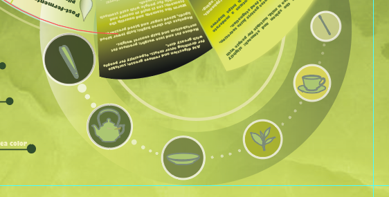
|
| Fig 3.5 Process Diagram |
 |
| Fig 3.6 Final Outcome - L.A.T.C.H. Infographic Poster |
Fig 3.7 Final Outcome - L.A.T.C.H. Infographic Poster (PDF).
A4 (100DPI)
FEEDBACK
Comments
Post a Comment