16 / 10 / 2024 — 23 / 09 / 2024 (Week 01 — Week 04
QIULIHUA/0365036
GCD 61004/Advanced Typography/Bachelor of Design (Honours)in Creative
Media/Taylor's University
Task 1 / Exercises: Typographic Systems & Type & Play
LIST
LECTURES
INSTRUCTIONS
EXERCISE
FEEDBACK
Reflection
Further Reading
LECTURES
AdTypo_1_Typographic Systems
All design is based on a structural system. There are eight
major variations with an infinite number of
permutations:
-
Axial
-
Radial
-
Dilatational
-
Random
-
Grid
-
Modular
-
Transitional
-
Bilateral
Typographic organisation is complex because elements are
dependent on communication to function. Hierarchy, reading
order, readability and contrast are additional criteria.
Typographic systems are similar to what architects call shape
grammars. They are similar but not identical. The system has a
unique set of rules that provide a sense of purpose that focuses
and guides decision making. It provides a solid framework for
learners.
-
Axial system: All elements are organized
to the left or right of a single axis.

|
|
FIG 1.0 Axial system (source: type 365)
|
-
Radial system:All elements are extended from a point of focus.

|
|
FIG 1.1 Radial system (source: type 365)
|
-
Dilatational system:All elements expand from a central point in a circular
fashion.

|
|
FIG 1.2 Dilatational system (source: type 365)
|
-
Random system: elements appear to have no
specific pattern or relationship.

|
|
FIG 1.3Random system
|
-
Grid system: A system of vertical and horizontal divisions.

|
|
FIG 1.4 Grid system
|
-
Transition system: An informal system of layered banding. The differences
of the size and the width is also important to create
hierarchy.

|
|
FIG 1.5 Transition system
|
-
Modular system:A series of non- objective elements that are constructed in
as a standardized units.

|
|
FIG 1.6 Modular system
|
-
Bilateral system: All text is arranged
symmetrically on a single axis.

|
|
FIG 1.7 Bilateral system
|
AdTypo_2_Typographic Composition
Principles of Design Composition
-
When designing compositions, elements such as
dominance, isolation, repetition, symmetry and
alignment need to be considered, while attention is
also paid to spatiality, perspective and a number of
other factors.
-
The challenges faced in translating abstract
concepts, such as typography or colour, into concrete
information highlight the importance of applying these
concepts on the page to promote understanding and
present information clearly.
The Rule of Thirds
This is a photographic guide to composition, it
basically suggest that a frame (space) can be divided into 3
columns and 3 rows. In fact, no one would choose to use the
three-pointed method when others are more favourable.

|
|
FIG 1.8 the rule of thirds
|
Typographic Systems
From the 8 systems the most pragmatic and the most
used system is the Grid System (or Raster Systeme),
which is derived from the grided compositional
structure of Letter Press printing.
Whilst the grid system may seem archaic or rigid, the
versatility and (to some extent) modular nature of the
system often allows for an infinite number of
adaptations.

|
|
FIG 1.9 grid system
|
In the new typographic system, chaos, randomness and
asymmetry became the main focus, and although readability
and legibility took a backseat, successful designs were
still able to combine the two effectively
David Carson and Paula Scher, among others, argue that this apparent chaos appealed to a
generation influenced by punk anti-establishment ideology,
leading to the gradual incorporation of asymmetry,
randomness, repetition and radial systems into the
language of design.

|
|
FIG 2.0Left to right: Paula Scher, Jonathan
Barnbrook and David Carson
|
Environmental Grid
This system is based on the exploration of an existing
structure ornumerous structures combined. An extraction
of crucial lines bothcurved and straight are formed. The
designer then organizes hisinformation around this
super-structure, which includes non-objectiveelements to
create a unique and exciting mixture of texture and
visualstimuli.
AdTypo_3_Context&Creativity
Context and Creativity
Handwriting
Handwritingwould become the basis or standard for form,
spacing andconventions mechanical type would try and
mimic.
The shape and line of hand drawn letterforms are
influenced by thetools and materials used to make them.
Sharpened bones, charcoalsticks, plant stems, brushes,
feather and steel pens all contributed tothe unique
characteristics of the letterform.
Additional factors included the material upon which the
forms werewritten: clay,papyrus, palm leaf, animal
skins(vellum andparchment) and paper.
 |
| FIG 2.1 Handwriting |
Cuneiform
C.3000 B.O.E.
Cuneiform, the earliest system of actual writing, was
used in a number of languages between the 34C. B C.E.
through the 1st century C.E.Its distinctive wedge form
was the result of pressing the blunt end of a reed
stylus into wet clay tablets.

|
|
FIG 2.2 Cuneiform
|
Hieroglyphics
2613-2160 B.C.E.
The Egyptian writing system is fused with the art of
relief carving. The system was a mixture of both rebus and
phonetic characters--the first link to a future alphabetic
system. Hieroglyphic images have the potential to be used
in three different ways:
1. As ideograms, to represent the things they actually
depict.
2. As determinatives to show that the signs preceding are
meant as phonograms and to indicate the general idea of
the word.
3. As phonograms to represent sounds that "spell out"
individual words.

|
|
Fig 2.3 Hieroglyphics
|
Early Greek (5th Century B.C.E.):
-
Developed from the Phoenician phonetic alphabet,
which originated from the Egyptian logoconsonantal
system.
-
Greeks added vowels to the Phoenician letters,
forming an alphabet of 22 letters.
-
Early Greek writing was read in a “boustrophedon”
style, where one line read left to right, and the
next line read right to left. The letters were
drawn freely without fixed directions, no serifs,
and had informal strokes.

|
|
Fig 2.4 Early Greek
|
Roman Uncials:
-
By the 4th century, Roman lettering became more
rounded, allowing for fewer strokes and faster
writing.
-
These letters, initially written with a flat brush
and carved into stone, were influential and served
as models for later calligraphers and type
designers.

|
|
Fig 2.5 Roman Uncials
|
English Half Uncials (8th Century):
-
In England, uncials evolved into a more slanted
and condensed form.
-
While this form evolved, writing across the
European continent regressed, requiring reform.
-
The Carolingian Handwriting Reform helped
standardize and improve this writing style.

|
|
Fig 2.6 English Half Uncials
|
Background:
After the fall of the Roman Empire, there was a decline
in literacy and a fragmentation of handwriting styles
across regions. For 300 years, writing skills were
mainly preserved in religious outposts.
Carolingian Minuscule:
-
To address the fragmentation, a court school was
set up under the direction of Alcuin of York. Under
Charlemagne’s patronage, efforts were made to
standardize language and book production.
-
This standardization included spelling,
pronunciation, and new conventions like capitalizing
the start of sentences, adding spaces between words,
and punctuation.
-
The result was the creation of the Carolingian
minuscule, a clear and uniform script that was used
for all legal and literary texts. It helped unify
communication across the European regions.
Significance:
The Carolingian minuscule was as significant as the
standard Roman capitals, as it became the foundation for
Humanistic writing in the 15th century, which later
served as the basis for modern lowercase Roman type.
Blackletter (12th-15th Century CE):
-
Originating in the Gothic period, Blackletter was a
key artistic expression from around 1200 to 1500.
-
The term “Gothic” was used by Italians to describe
the cultures north of the Alps, which they
considered barbaric.
-
Blackletter features tightly spaced, condensed
vertical lines, which reflected the Gothic
architectural style (emphasizing verticality and
pointed arches). This lettering style was practical,
as condensing lines and letter spacing helped save
costly materials in book production.
Italian Renaissance:
-
As the Gothic era peaked in northern Europe,
scholars in Italy began to revive elements of
ancient Greek and Roman culture, marking the
Renaissance.
-
The Renaissance brought a focus on classical
aesthetics, influencing not only art and
architecture but also the design of letterforms. The
period saw a move towards more refined, rationalized
letter shapes.
-
Humanist scholars embraced and admired the
Carolingian script for its clarity and legibility,
and this led to the creation of Antica letterforms,
which were more regular and balanced, laying the
groundwork for modern typography.
Movable Type Printing
Movable type printing began in East Asia, with China,
Korea, and Japan practicing block printing by the 8th
century. The earliest known printed book is the Diamond
Sutra (868 CE). While China attempted movable type, it
was hindered by the complexity of its characters. In the
late 14th century, Korea successfully developed bronze
movable type, aided by their creation of the simpler
Hangul script. This advancement came several decades
before Gutenberg’s printing in Europe (1439). Though
pioneered by China, movable type was perfected in
Korea.

|
|
Fig 2.7 Movable Type Printing
|
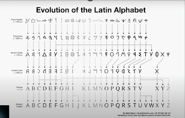
Evolution of Middle Easter Alphabets: it is also
important to note that while the Phoenician letter marks
a turning point in written language-use of sound
represented in letters--the script itself has been
possibly influenced by the Egyptian Hieroglyphics and
Hieratic Scripts.

|
|
Fig 2.8 Middle Easter Alphabets
|
The Evolution of the Chinese script: From the Oracle
bone to Seal Script to Clerical Script, Traditional and
Simplifed scripts.

|
|
Fig 2.9 Chinese script
|
The oldest writing found in the 'indian' subcontinent
the Indus Valley Civilization(IVC) script (3500-2000
BCE).is as yet undeciphered and seems to have been
somewhat logo-syllabic in nature.

|
|
Fig 3.0 IVC script
|
The Brahmi script (450-350 BCE) is the earliest writing
system developed in India after the indus script. it is
one of the most influential writing systems; all modern
Indian scripts and several hundred scripts found in
Southeast and East Asia are derived from Brahmi.

|
|
Fig 3.1 Brahmi script
|
The oldest writing systems present in Southeast Asia
were Indian scripts.There were a few, but the most
important would be Pallava (or Pallawa in Malay),a South
Indian script originally used for writing Sanskrit and
Tamil.
Pallava was the basis for writing systems across
Southeast Asia.But Pallava wasn't the only Indian script
in use in the Malay Archipelago. Another was Pra-nagari,
an early form of the Nagari script, used in India for
writing Sanskrit.

|
|
Fig 3.2 Indian scripts
|
This is lndonesia's most important historical script:
Kawi. Based on Nagari, but indigenous to Java.
It was the script used for contact with other kingdoms.
Because it was so widespread, Kawi became the basis of
other scripts in both lndonesia and the Philippines.This
means that ancient kingdoms in of the Malay Peninsula
would have been using both Indian scripts and Kawi to
write old Malay language

|
|
Fig 3.3 Kawi
|
Jawi, the Arabic-based alphabet.Jawi was introduced
with Islam, but its spread was more gradual. In
class-based Hindu societies, literacy was limited to the
upper classes. Muslim traders, teaching Jawi for
religious purposes, helped it spread among the middle
and upper classes. However, it didn’t fully replace
other scripts in all areas.

|
|
Fig 3.4 Jawi
|
AdTypo_4_Designing Type
Designing tpye:
- type design carries a social responsibility so one must continue toimprove its legibility.
- type design is a form of artistic expression.
type designers :
- Adrian Frutiger is known for creating the “Frutiger” typeface, which was designed for readability in various lighting conditions and from different distances, particularly for use in airport signage. His work focused on ensuring clarity and legibility, crucial for fast-paced environments.
- Matthew Carter designed “Verdana,” a typeface commissioned by Microsoft, which was optimized for legibility on digital screens, especially at smaller sizes. This reflects.
- Edward Johnston created the iconic “Johnston Sans” for the London Underground, which has been recognized for its modern yet timeless appeal, combining classical proportions with a humanist touch.
General Process of Type Design:
- Research: Understanding the history and anatomy of type, along with technical considerations like metrics and hinting.
- Sketching: Initial designs may be created by hand or directly through digital tools, depending on the designer’s preference.
- Digitalization: Specialized software is used to convert sketches into digital formats, where attention to form and counter form is essential.
- Testing: Rigorous testing ensures readability and legibility, especially for functional text designs.
- Deployment: Even after launch, typefaces may undergo further refinement based on feedback and real-world usage.
Typeface Construction:
Roman Capital: The grid consists of a square, and inside it a circlethat just touches the lines of the square in four places. Within thesquare, there is also a rectangle. This rectangle is three quarters thesize of the square and is positioned in the centre of the square.
 |
| Fig 3.5 Construction grid for the RomanCapital using 8 x 8 cells |
Construction and considerations:
Depending on their form andconstruction, the 26 characters of thealphabet can be arranged intogroups, whereby a distinction ismade between a group for thecapitals and a group for lowercaseletters.
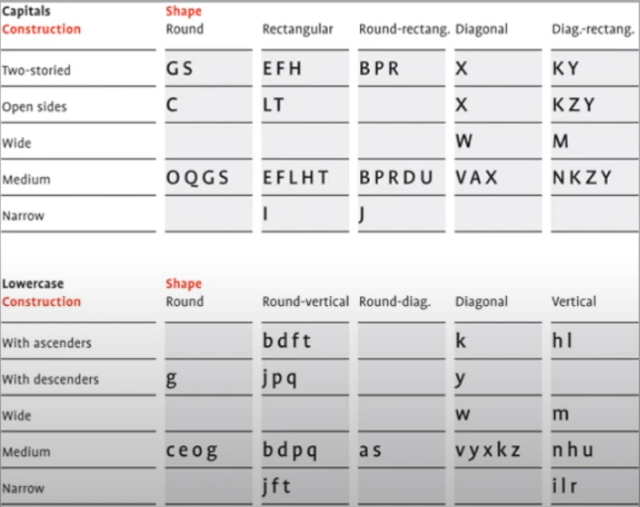 |
| Fig 3.6 Classification according to form and construction |
Construction and considerations:
Many different forms and constructions must be taken into accountwhen designing a new type. An important visual correction is theextrusion of curved (and protruding) forms past the baseline and capline. This also applies to vertical alignment between curved andstraight forms.
 |
| Fig3.7 Example of fitting |
INSTRUCTIONS
EXERCISE
Task 1:exercise
Exercise 1 — Typographic System
Export final artworks as JPEG @300ppi; PDF with
and without guides (turn on/off guides when saving PDF; turn
off spreads when exporting). Compile all 8 systems together
for presentation. See sample submissions below.
For the poster ,i decided to use this as a poster "All
RippedUp:PunkInfluences onDesign"
1. Axial
ITC New Baskerville Std(Bold,Roman)

|
|
Fig3.5 Axial system
|
For the axial system, I tried a left-right arrangement, and in the
second one I changed the colour of the squares to get the image
out of the black and white monotone.
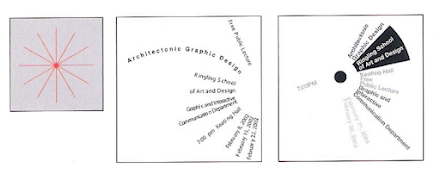
2. Radial
ITC New Baskerville Std(Bold,Roman)

|
|
Fig 3.6 Radial system
|
For the Rodial system, I used the centre of the circle as
the centre point, I changed the transparency of some of the
fonts in order to show the hierarchy, and I added a red graphic
at the bottom in order to show ‘All RippedUp: PunkInfluences
onDesign’ as the title.
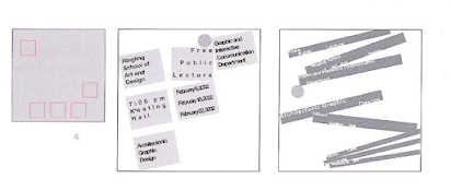
3. Dilatational
ITC New Baskerville Std(Bold)

|
|
Fig 3.7 Dilatational system
|
For the Random system, I used the red circle in the
centre as the centrepiece, with all the text content
surrounding the centrepiece to give the visual impression of a
swirling vortex
4. Random
ITC New Baskerville Std(Bold Italic)

|
|
Fig 3.8 Random system
|
For Random stystem, when I put the text content layout
design, I use the misplaced design method to create a sense
of chaos, so that the whole shows a sense of freedom and
randomness, and I designed a small red square in the upper
left corner to retain the visual impact.
5. Grid
ITC New Baskerville Std (Bold)
%20conflict5.jpg)
|
|
Fig 3.9 Grid system
|
For the Grid system, I used a combination of horizontal text
and vertical text to create a visual order.
6.Transition system
ITC New Baskerville Std(Bold,Roman)
%20conflict6.jpg)
|
|
Fig 4.0 Transition system
|
For the Transition system, in order to emphasize the fluidity
and consistency of the interface, I've tilted the fonts and
lines downward and enlarged the "" to contrast it with the
content text.
7.Modular system
ITC New Baskerville Std(Bold,Roman)
%20conflict7.jpg)
|
|
Fig 4.1 Modular system
|
For the Modular system, I designed 9 identical circles in the
interface and entered the content in the circles.
8.Bilateral system:
ITC New Baskerville Std(Roman)
%20conflict8.jpg)
|
|
Fig 4.2 Bilateral system
|
For the Bilateral system, I designed a red square underneath
the symmetrical content in order to make the picture more
symmetrical, which better emphasizes the symmetry of the
picture.
Final typographic system:
%20conflict.jpg)
|
|
Fig 4.3 Axial system
|
%20conflict2.jpg)
|
|
Fig 4.4 Axial system
|
%20conflict3.jpg)
|
|
Fig 4.5 Dilatational system
|
%20conflict4.jpg)
|
|
Fig 4.6 Random system
|
%20conflict5.jpg)
|
|
Fig 4.7 Grid system
|
%20conflict6.jpg)
|
|
Fig 4.7 Transition system
|
%20conflict7.jpg)
|
|
Fig 4.8 Modular system
|
%20conflict8.jpg)
|
|
Fig 4.9 Bilateral system
|
Final typographic system (pdf)
Fig 5.0 Typographic System Final Grid / Baseline (PDF)
Fig 5.1 Typographic System Final JPEG (PDF)
Exercise 2:Finding Type (Type & Play)
Final Submission should consist of:
- Image
- Extracted Letterforms on baseline
(illustrator)
- Final letterforms on baseline
- Original extraction and final
letterforms next to each other
For the Exercise 2, we were first asked to choose a
picture that contained a potential letter form. I chose a
photo of leaf veins as the photo from which to extract the
letterforms at a later stage.

|
|
Fig 5.2 choose image
|
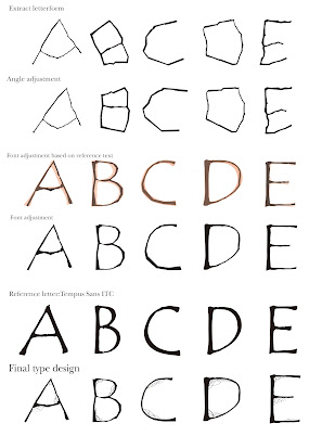
I extracted the letters ‘A, B, C, D, E’ from this
image.

|
|
Fig 5.3alphabetic process
|
Version 1 :

|
|
Fig 5.4 Version 1
|
Version 2 :
Mr. vinod suggested that I add some veins to the final font
and that it fit the theme I chose

|
|
Fig 5.5 change final font
|
Evolutionary process :
|
|
Fig 5.6 Evolutionary process
|
Extracted letterforms:

|
|
Fig 5.7 Extracted letterforms
(baseline)
|
Reference font:

|
|
Fig 5.8 Reference font
|
Final letterforms :

|
|
Fig 5.9 Final letterforms
|
Original extraction (top) and final letterform
(bottom) comparison:
 |
| Fig 6.0 Original extraction (top) and final letterform (bottom) comparison |
Final Finding Type (Type & Play)【PDF】
Fig 6.1 Exercise 2:Final Finding Type (Type & Play)【PDF】
Exercise 2 — Type & Play Part 2
Final Poster :
1.Complete Exercise 1 and 2; rework, refine, review,
re-look, re-do whatever is needed in the two exercise
and complete it before week 4's class.
2. Size of poster is 1024px x 1024px (Export JPG
300ppi)
My letter forms were taken from leaf veins, so I looked for images with similar expressions.
 |
| Fig 6.2 Collected images |
But I ended up choosing three images from among them that I thought were better for my work.
 |
| Fig 6.3 Final choose images |
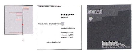
poster process:
 |
| Fig 6.4 poster process |
SO i make three poster
 |
| Fig 6.5 #layout 1 (left) #layout 2 (middle) #layout 3(right) |
Mr.viond suggested that I narrowed down the words next to the leaves and enlarged the main letters.
 |
| Fig 6.6 poster change process |
Final poster :
 |
| Fig 6.6 Final poster (JPE) |
Final poster (pdf)
Fig 6.7 final poster (PDF)
FEEDBACK
WEEK 1
General feedback: In the first lesson, Mr Vinod
explained the rules of the Advanced Typography
class.
Specific feedback: Sketching in Adobe In Design
based on the eight typesetting systems.
WEEK 2
General feedback: We're going to start the
second task, keying out the font from the image
Specific feedback: for the Modular system, Mr
viond suggested that I remove the half circle and replace
it with the same circle. for the Bilateral system, the
circle could be placed underneath to better demonstrate
symmetry. for the Axial system, change the formatting of
the text on the right hand side of the layout to align it
with the left hand side. The Axial system design changes
the formatting of the text on the right to align with the
left.
WEEK 3
General feedback: This week I finished extracting,
evolving and finalising the typeface design. Next I will
be creating a poster using the extracted fonts
Specific feedback: Mr. vinod suggested that I add some
veins to the final font and that it fit the theme I chose.
Week 4
General Feedback:We completed Task 1 of this lesson this week and began working on the next task: key artefacts and collateral
Specific feedback:Mr.viond suggested that I narrowed down the words next to the leaves and enlarged the main letters.
Reflection
Experiences
After learning about the eight typographic systems in the first exercise, I was able to gain a deeper understanding of how to organise and present information in different layout styles to enhance the visual impact of a design and the efficiency of information delivery. It allows me to create more It allows me to create more designs and also to give the reader a deeper understanding of my designs.
In the second exercise, I learned how to extract letters from a picture, which I think was the most interesting and inspired me to create more and discover more.
Observations
I am proficient in how to use Adobellustrator to produce my work, I have increased my efficiency compared to last semester's, and I also found the class feedback to be very helpful in the assignment instructions to allow me to make timely changes to my work
Findings
I have found that typography is more than just arranging words and pictures, it is an effective way of expressing information. Understanding the characteristics, advantages and disadvantages of each typographic element allows for better selection of the appropriate design approach to ensure clear delivery of information while enhancing visual appeal. It can help designers to better create works that are both functional and creative.
Further Reading
I choose the 《Typographic-Systems-Book-Kimberly-Elam》 books.It is convenient for me to better understand the eight elements typesetting will help me design the following eignt element.
《Typographic-Systems-Book-Kimberly-Elam》 by Kimberly Elam explores eight fundamental typographic systems, providing insights into how these structures can be used to create dynamic, effective, and visually engaging designs. The book is a guide to understanding and applying different typographic layouts, helping designers create well-organized and aesthetically pleasing compositions.
 |
| 《Typographic-Systems-Book-Kimberly-Elam》 |
Axial System:
All elements are organized either tothe left or right of a single axis.
 |
| Axial System |
Radial System:
All elements extend from a pointof focus.
 |
| Axial System |
Dilatational System:All elements expand from a centralpoint in a circular fashion.
 |
| Dilatational System |
Random System:
Elements appear to have no specific pattern or relationship.
 |
| Random System |
Grid System:
A system of vertical and horizontal divisions.
 |
| Grid System |
Transitional System
An informal system of layered banding
 |
| Transitional System |
Modular System :
a series of non-objective elementstare constructed as standard-ced units.
 |
| Modular System |
Bilateral system:
All text is arranged symmetrically on a single axis.
 |
| Bilateral system |
Visual Examples and Analysis
- Each system is explained with visual examples, which help readers understand how these layouts can be applied in practice. The book analyzes designs by well-known typographers and graphic designers, breaking down how they use these systems to create successful compositions.
- These examples include posters, book covers, brochures, and more, illustrating how each system brings a unique visual characteristic to the design.
Principles of Design and Composition
The book dives into the principles of design, such as balance, contrast, rhythm, and hierarchy. Understanding these principles is essential to effectively using typographic systems.
While this book showcases how to use typography not only as a tool for communication but also as a visual element that adds to the aesthetics of the design.
In conclusion ,This book Through examples, theory, and exercises, the book provides a comprehensive guide to understanding the power of typography and how to manipulate it to create compelling designs.


%20conflict5.jpg)
%20conflict6.jpg)
%20conflict7.jpg)
%20conflict8.jpg)
%20conflict.jpg)
%20conflict2.jpg)
%20conflict3.jpg)
%20conflict4.jpg)
%20conflict5.jpg)
%20conflict6.jpg)
%20conflict7.jpg)
%20conflict8.jpg)


Comments
Post a Comment