April 22,2024
4.6.2024 -7.7.2024(week6-week8)
QIULIHUA/0365036
Typography/Bachelor of Design (Honours)in Creative Media
Task 2:Typography Formatting & Expression
LIST
FEEDBACKLECTURES
Lecture 6: Typo_5_Understanding
1. Understanding letterforms
The uppercase letter forms below suggest symmetry. But in fact it is not symmetrical.It is easy to see the two different stroke weights of the Baskerville stroke from(below)
More noteworthy is the fact that each bracket connecting the serif to the stem has a unique arc.

|
| Fig 1.0 Baskerville 'A' |

|
| Fig 1.1 Univers 'A' |
The complexity of each individual letterform is neatly demonstrated by examining the lowercase ‘a’ of two seemingly similar sans-serif typefaces—Helvetica and Univers. A comparison of how the stems of the letterforms finish and how the bowls meet the stems quickly reveals the palpable difference in character between the two.

|
| Fig 1.2 Helvetica 'a' and Univers 'a' |
2. Maintaining x-height
The x-height generally describe the size of the lowercase letterforms.Such as in 's',such as in ‘s’, must rise above the median (or sink below the baseline) in order to appear to be the same size as the vertical and horizontal strokes they adjoin.

|
| Fig 1.3 Lowercase maintaining x-height |
3. Form and Counterform
The space describes, and often contained, by the strokes of the form. When letters are joined to form words, the counterform includes the spaces between them. Counterform has the same importance as the letterforms as it helps to recognize the shape of the letters and assure the readability of the words.

|
| Fig 1.4 Form and Counterform |
4. Contrast
The simple contrasts produces numeerous variations: small+organic/Iarge+machined;small+dark/large light,etc

|
| Fig 1.5 Contrast |
Lecture 7: Typo_6_Screen&Print
Typography in different medium
No changes were made once a publication was edited, typeset and printed
Print Type vs Screen Type
1.type of print
The type was designed intended for reading from print long before we read form screen. It's the designer's job to ensure that the text is smooth,flowing, and pleasant to read.
typeface for print-Caslon,Garamond,Baskerville (characteristics: elegant and intellectual, highly readable at small font size)

|
| Fig 1.7Type for print |
2. Type for Screen
Typefaces intended for use on the web are optimized and often modifies to enhance readability and performance on-screen in a variety of digital environments.
Examples of adjustments: taller x-height or reduced ascenders and descenders, wider letterforms, more open counters heavier thin strokes and serifs, reduced stroke contrast, modified curves and angles, etc.
Another important adjustment-more open spacing(especially for typeface).
All the adjustments were made to improve character recognition and overall readability in non-print environments (web, e-books, e-readers ad mobile devices).
3. Hyperactive Link / Hyperlink
A hyperlink is a word, phrase, or image that you can click on to jump to a new document or a new section within the current document. Hyperlinks can be found on nearly all web pages. Text hyperlinks are normally blue and underlined by default.
4. Font Size for screen
16-pixel text on a screen is about the same size as text printed in a book or magazine, accounting for reading distance. Printed text is typically set at about 10 points within the reading distance of a few inches away, while at least 12 points within the reading distance of arm's length, which is about the same size as 16 pixels on most screens.
5. System Fonts for Screen / Web Safe Fonts
Each device comes with its own pre-installed font selection. Which is based largely on its operating system. The problem is that each differs a little bit
Web safe fonts: Open Sans, Lato, Arial, Times New Roman, Times, Courier New, Courier, Verdana, Georgia, Palatino, Garamond
6. Pixel Differential between Devices
The text on screens in different devices (PCs, tablets, phones and TVs) differs in size and proportion because of the different-sized pixels of the screens. Even within a single device class, there will be a lot of variation.

|
| Fig 1.8Pixel Differential between Devices |

|
| Fig 1.9 Visual References |

|
| Fig2.0 Sketches |

|
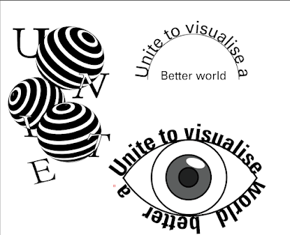
| Fig2.1 Type Expression Digitisation |

|
| Fig2.2 Layouts and Layouts blocked out |

|
| Fig 2.3 Final layout (without grids) |

|
| Fig 2.4Final layout (with grids) |
- General feedback: I learnt more about typography and practised on one of the three different articles provided in class.
- Specific feedback: When working on the draft, as I had been designing around one angle, Mr Max suggested that I look at different angles of the title.
- General feedback: I learnt more skills about the use of ai to further improve the design expressed in my drafts
- Specific feedback: Mr Max chose to digitise #1, #2 and #5.
- General feedback: This week was independent study week and I used the id to complete my final work!
- Specific feedback: Mr Max chose the third layout with the orbs as my final work.

|
| Fig 2.6TypographyBasics |


Comments
Post a Comment