
5.6.2024( WEEK 5)
Group 4
QIULIHUA/0365036
Digital Photography & Imaging/Bachelor of Design (Honours)in Creative Media
LECTURE
POSTER DESIGN
introudction:
- The principles of design are the rules a designer must follow to create an effective and attractive composition.
- The fundamental principles of design are: Emphasis, Balance and Alignment, Contrast, Repetition, Proportion, Movement and White Space.
- A design doesn’t have to strictly follow these rules to be “good.”
The 7 principles of poster design
1.EMPHASIS

|
| Fig 1.0 EMPHASIS |

|
|
| fig 1.1 Balance and alignment |
The principles of design are the rules a designer must follow to create an effective and attractive composition.
3.CONTRAST

|
| Fig 1.2 CONTRAST |
Contrast creates space and difference between elements in your design. Your background needs to be significantly different from the color of your elements so they work harmoniously together and are readable.
4. REPETITION
|
| fig 1.3 REPETITION |
Repetition can unify and enhance the design.
5. PROPORTION

|
| fig 1.4 PROPORTION |
Proportion is the visual size and weight of elements in a composition and how they relate to each other. It often helps to approach your design in sections, instead of as a whole.
6. PROPORTION
|
| fig 1.5 PROPORTION |
Movement is controlling the elements in a composition so that the eye is led to move from one to the next and the information is properly communicated to your audience.
7.WHITE SPACE

|
| fig 1.6 WHITE SPACE |
White space (or negative space) is the only one that specifically deals with what you don’t add. White space is exactly that—the empty page around the elements in your composition.

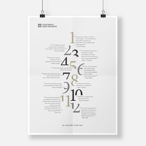
|
| fig2.2 EXERCISE1 |

|
| fig2.3 EXERCISE1 process |

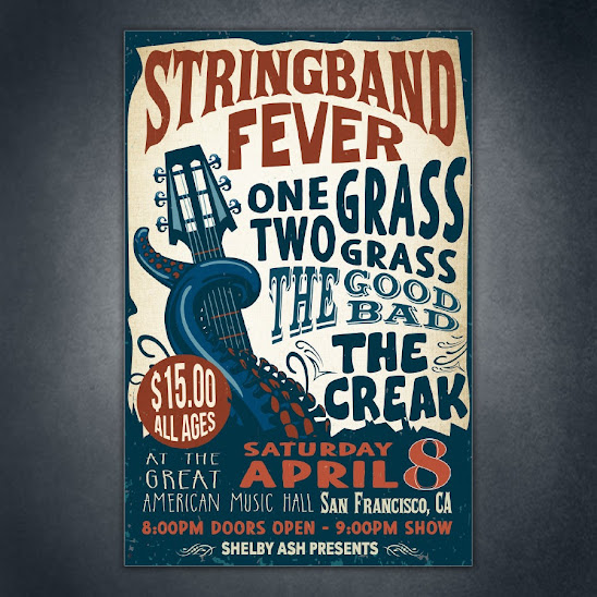
|
| fig2.4 EXERCISE2 |

|
| fig2.4 EXERCISE2 process |
FEEDBACK
Comments
Post a Comment